OBJECTIVE
In commemoration of its 300th anniversary, Kolpino City underwent a comprehensive rebranding initiative focused on revitalizing both its logo and corporate identity. The primary objective remained the establishment of a unique corporate identity and branding design, one that could seamlessly extend across various facets of the city, including government and municipal buildings, public spaces, souvenir products, festival venues, sponsor booths, and informational and promotional materials. Throughout this transformation, the city strived to forge an identity that deeply resonated with Kolpino residents, while also integrating contemporary trends in branding design, all the while preserving its historical roots and cherished traditions.
SOLUTION
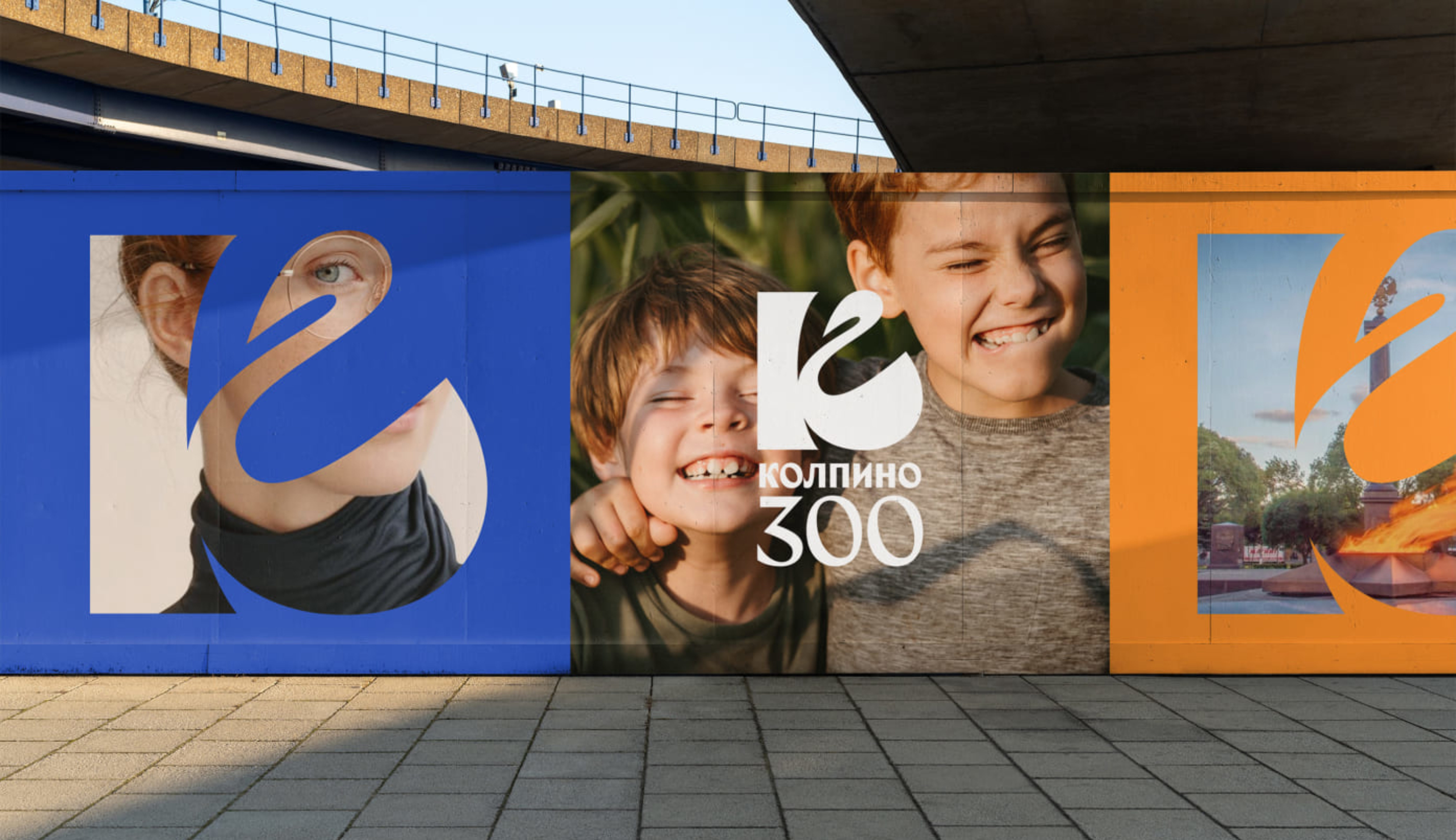
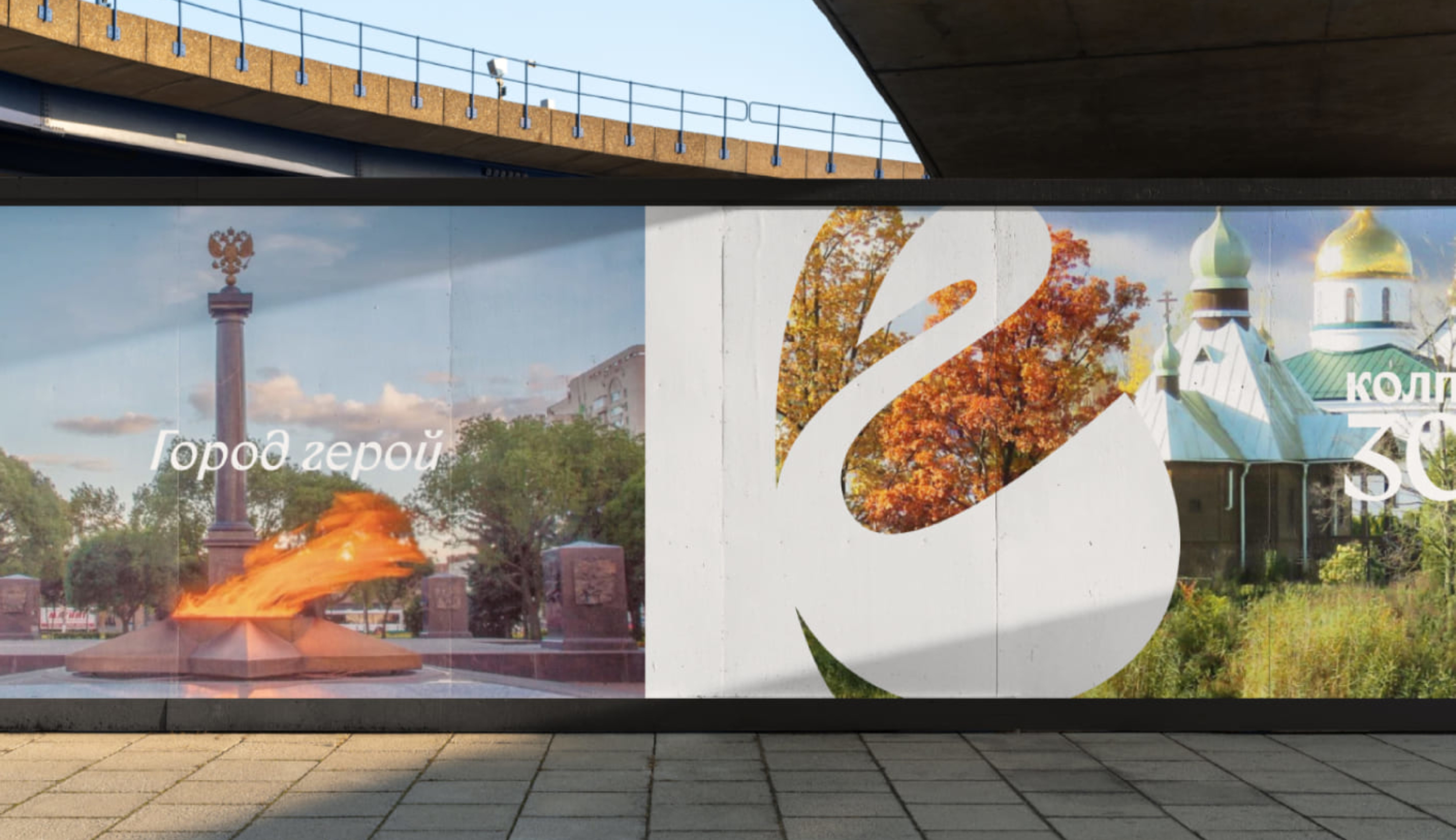
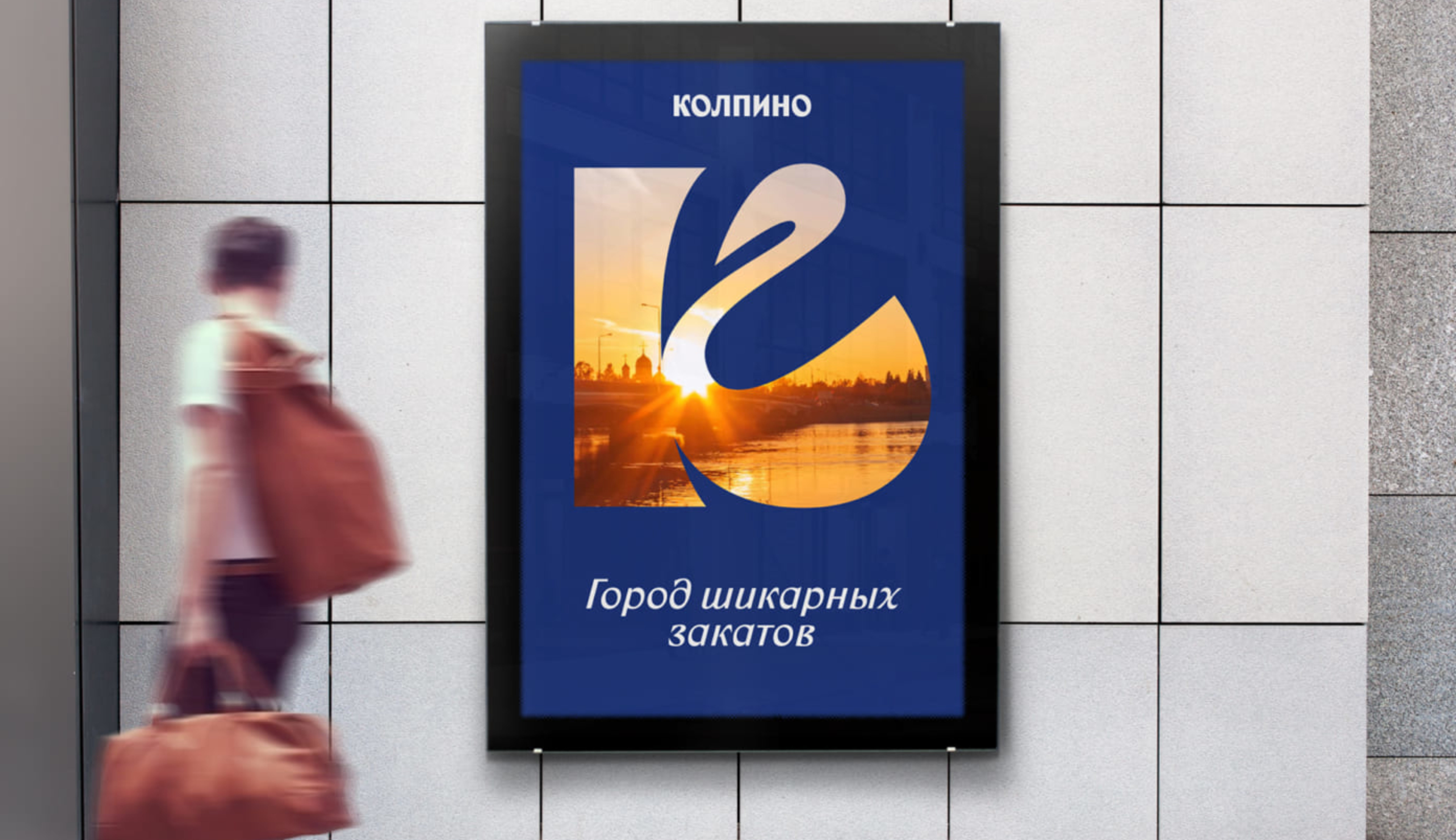
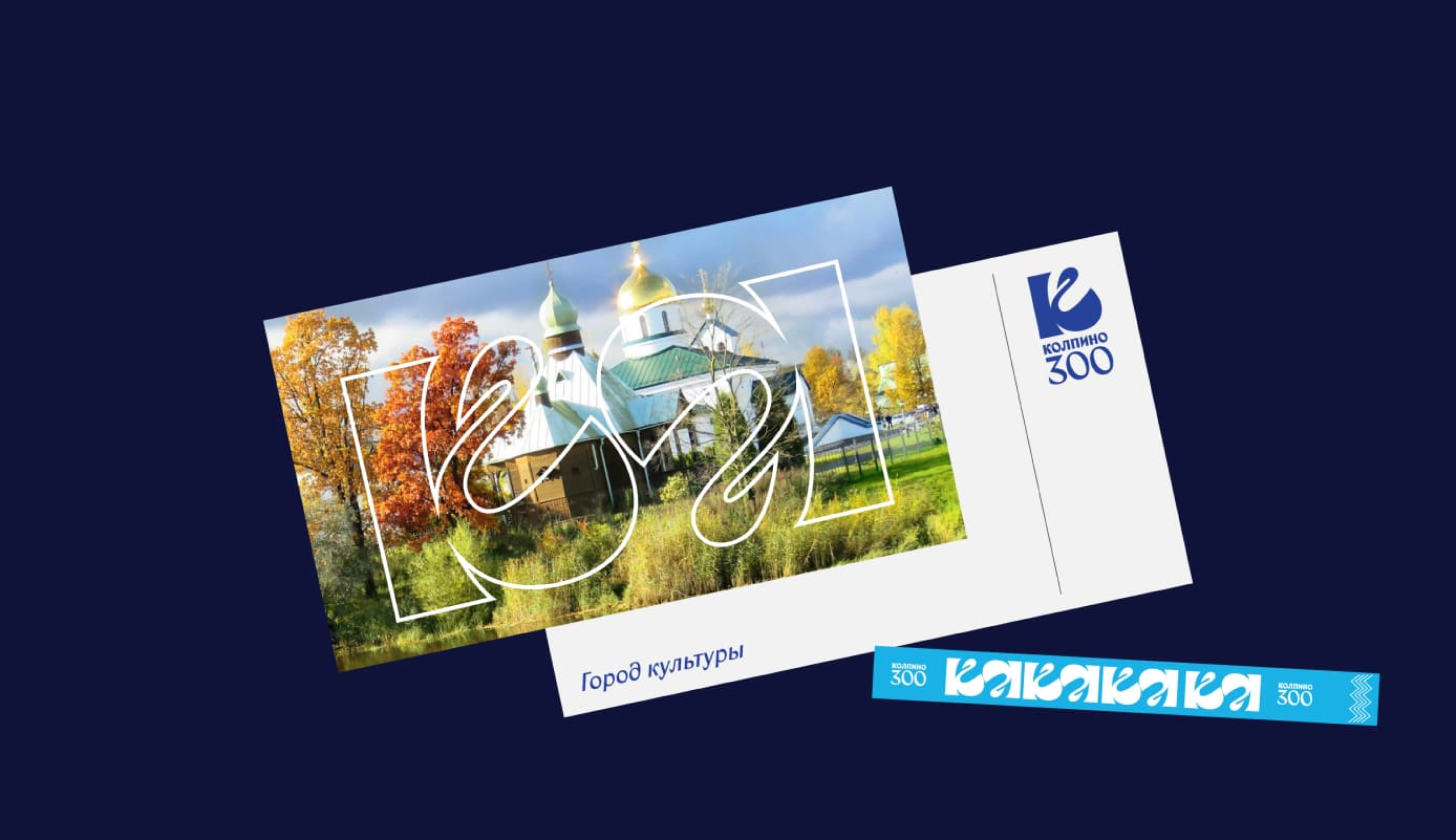
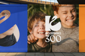
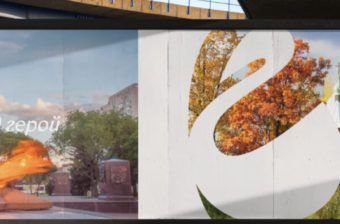
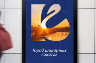
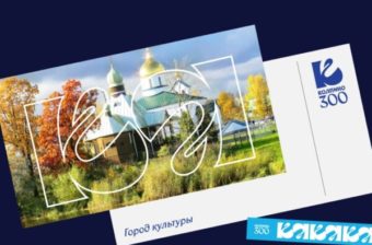
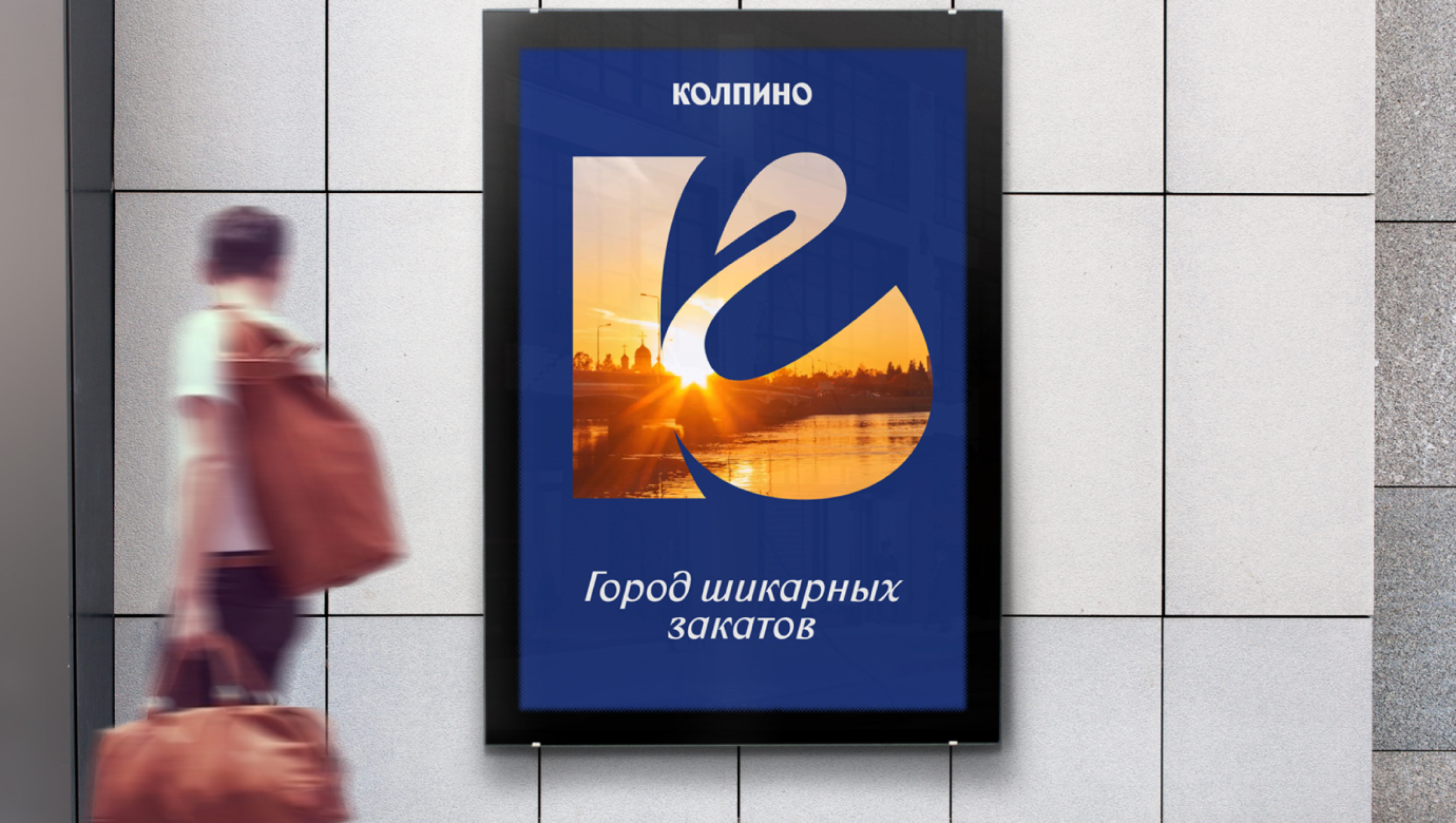
Building upon extensive historical, cultural, semiotic, and marketing research, we pinpointed crucial concepts for Kolpino’s corporate identity and new logo. Our decision was to forge a strong connection between the logo and the city’s name, embracing the swan as an informal emblem of Kolpino, along with the Izhora River and city canals. The result? A new logo showcasing a stylized letter K, with its base mirroring the graceful curve of the Izhora River and the side lines elegantly resembling a swan’s arched neck. This meticulous design approach yielded a compelling composition, seamlessly merging the city’s name with the evocative imagery of the river and swan – two symbols deeply cherished by Kolpino’s residents. Every element of the logo was crafted by hand, ensuring a truly authentic representation.