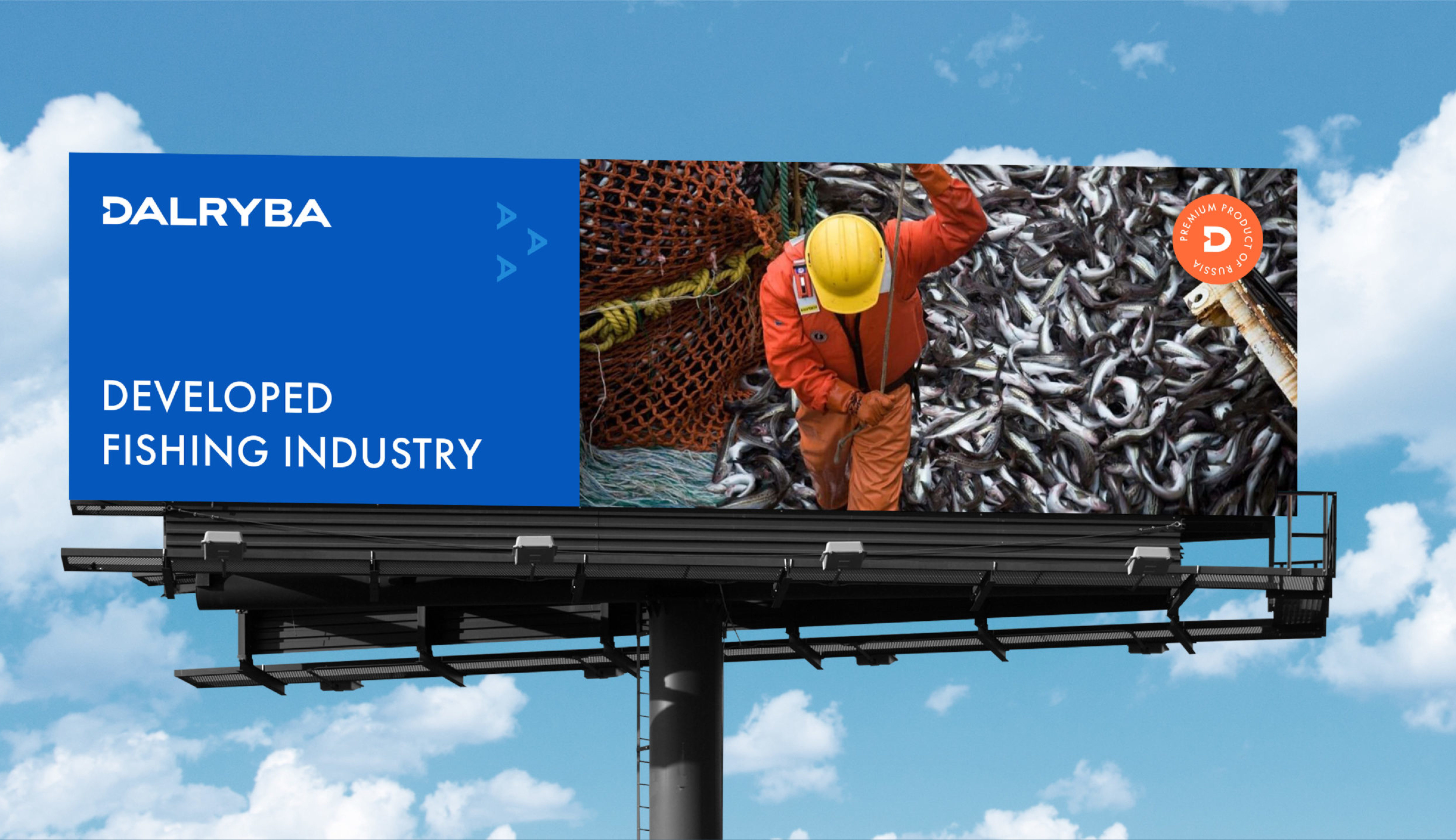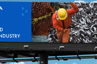
OBJECTIVE
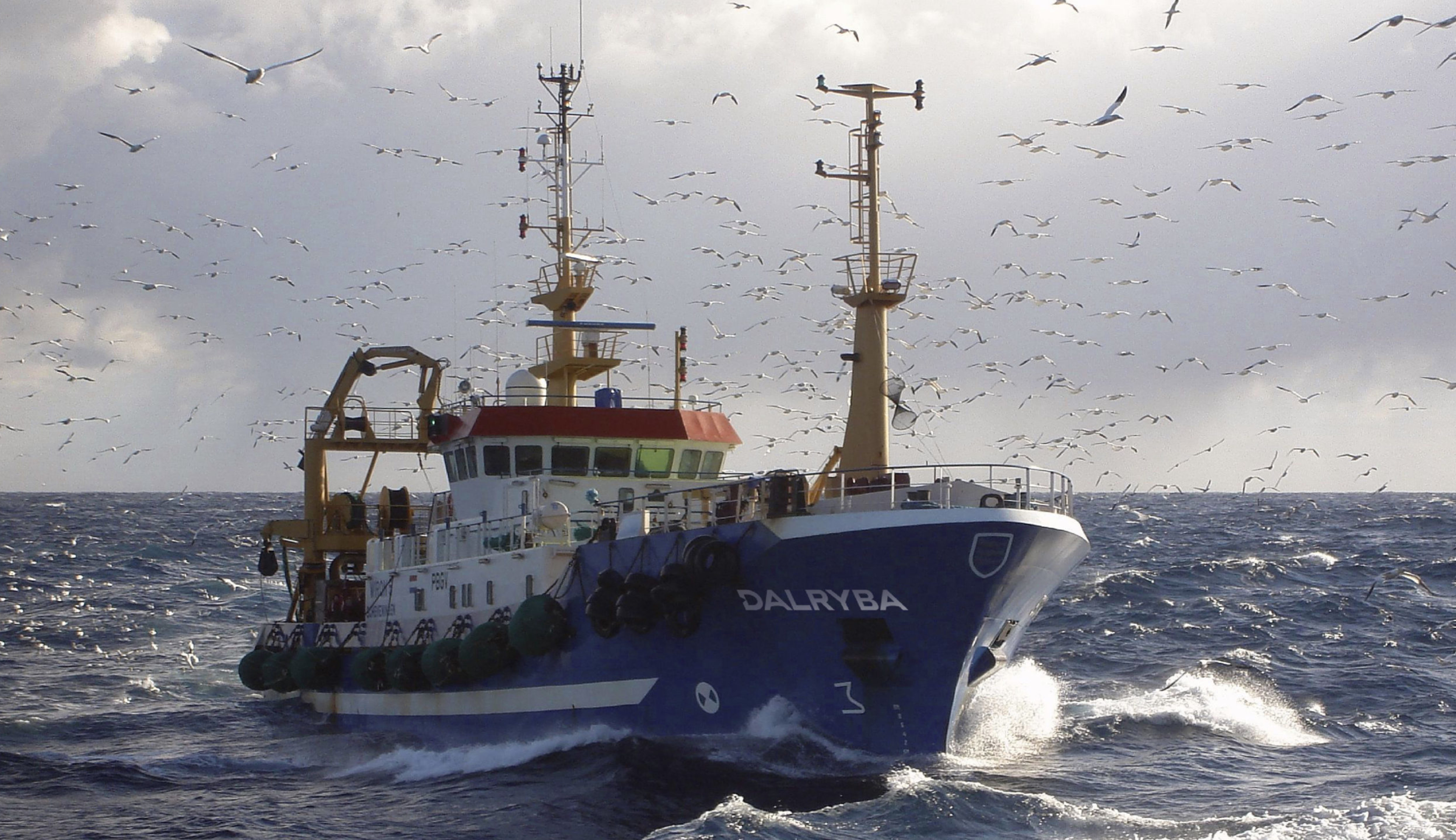
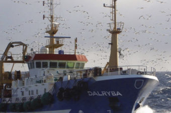
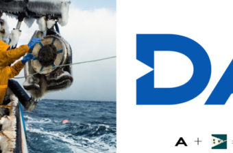
Dalryba, a fishing and fish processing company, boasts an impressive 60-year legacy in the Far East. They provide top-tier products to both the Japanese and Russian markets. As they embark on an expansion journey and celebrate their 60th anniversary, the company decided to refresh its brand identity.
SOLUTION
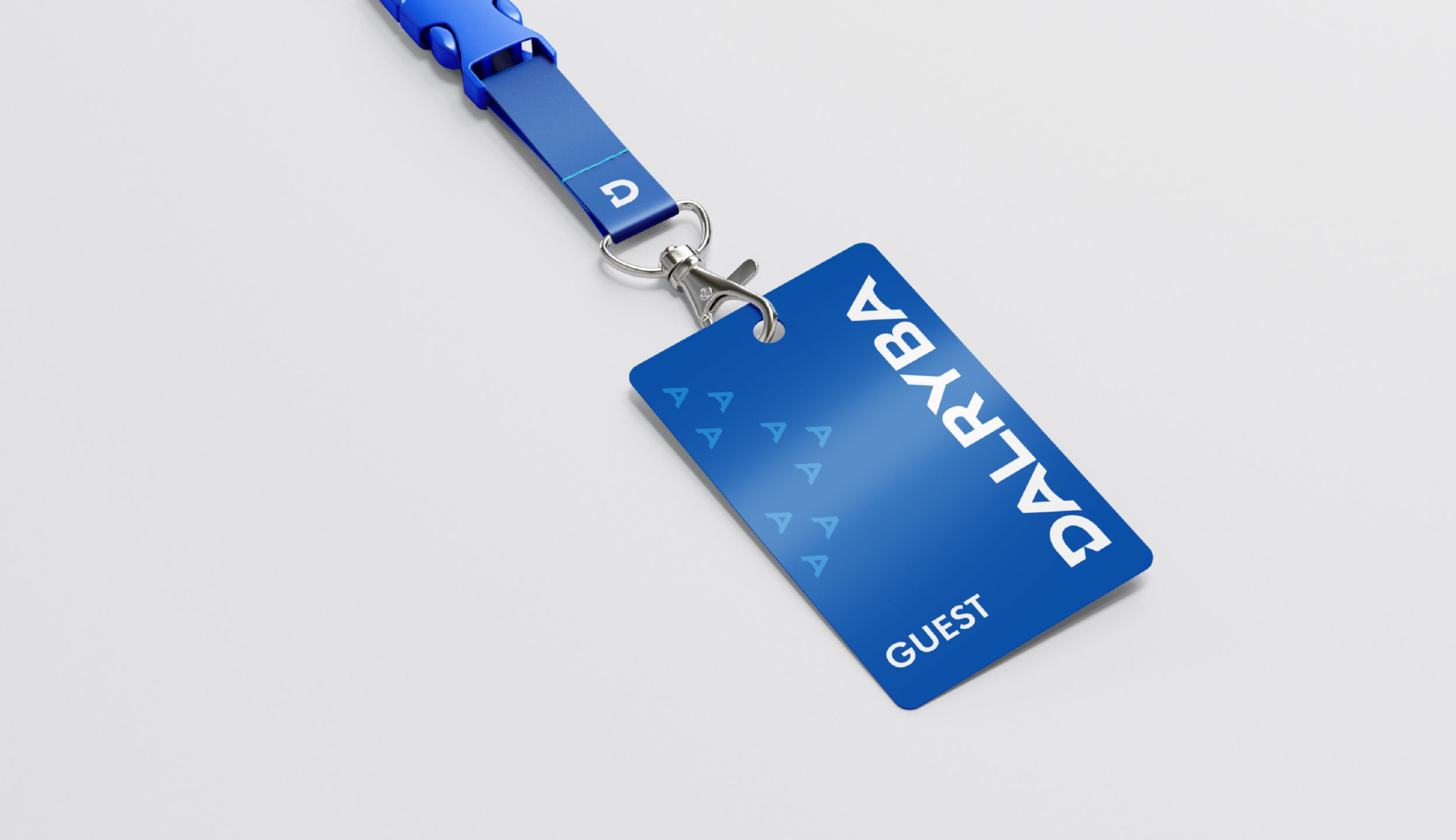
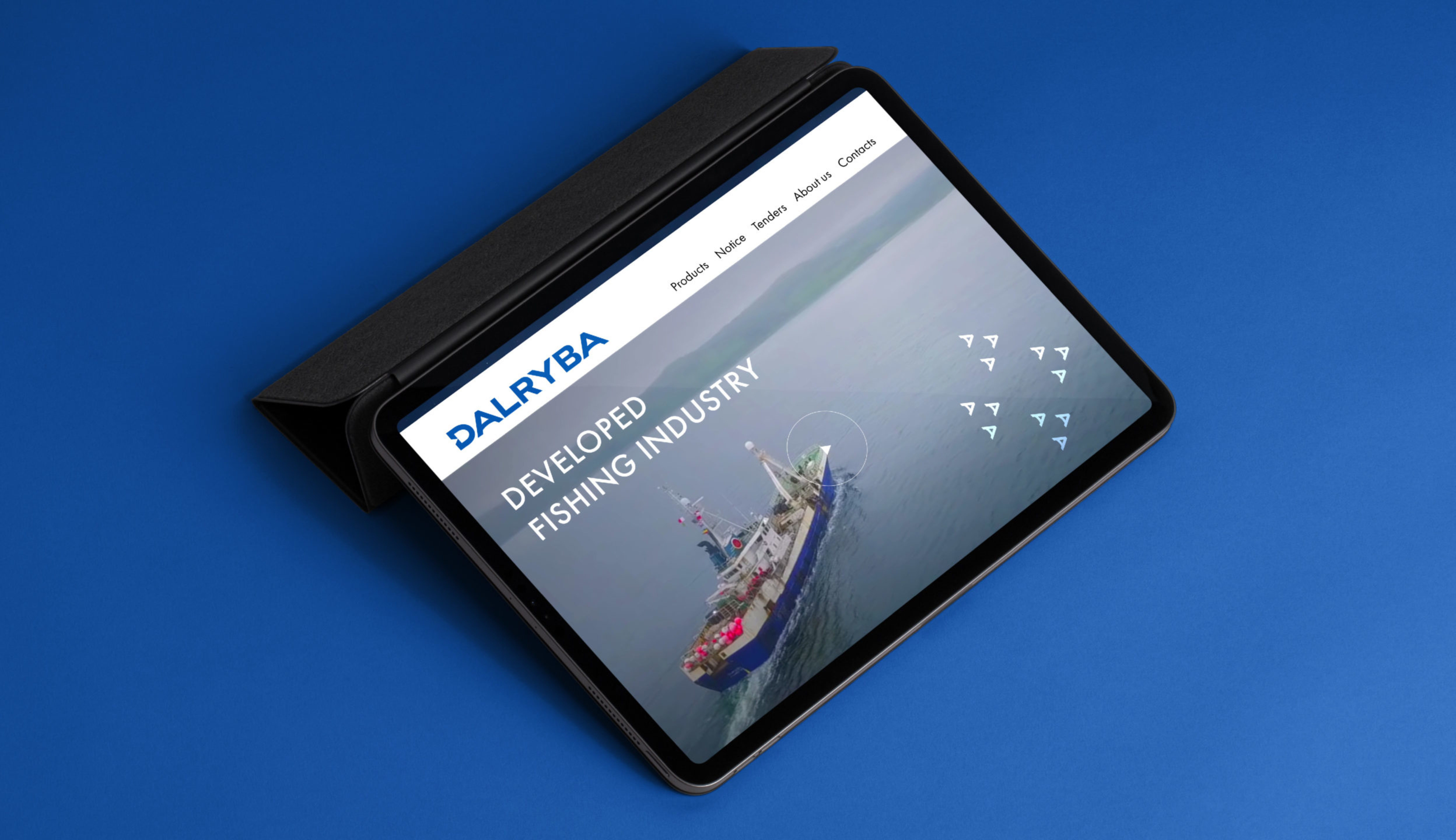
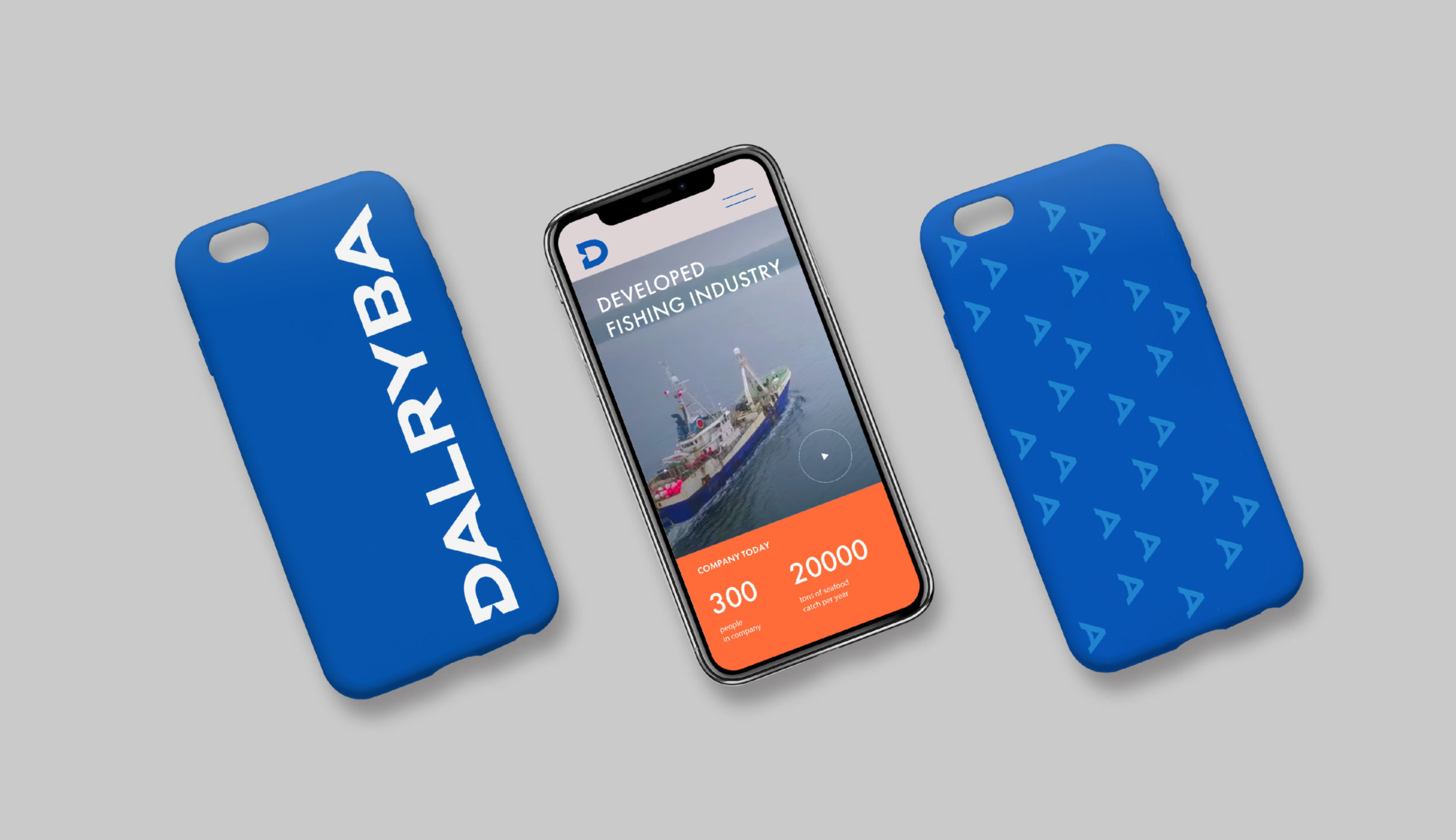
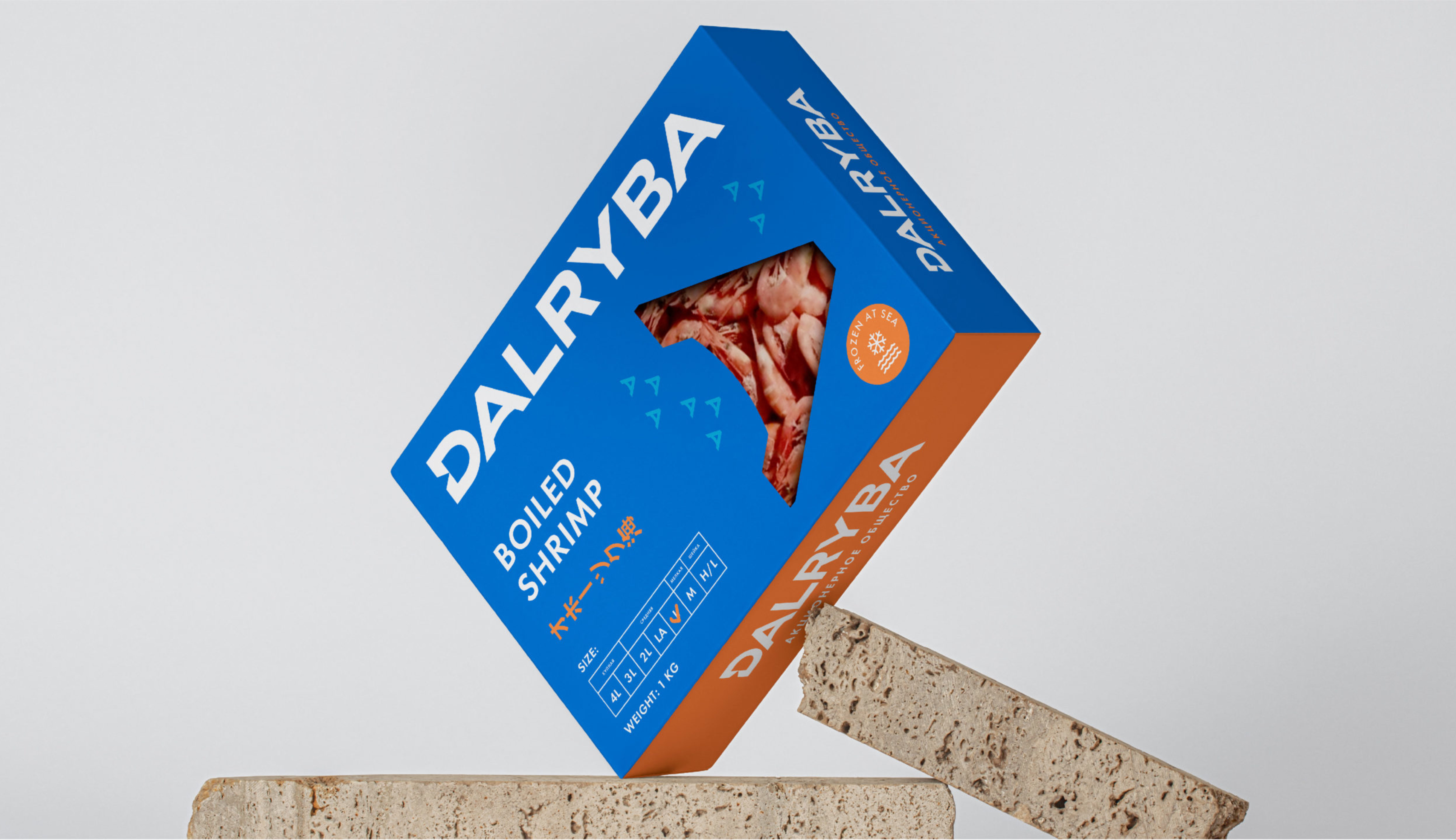
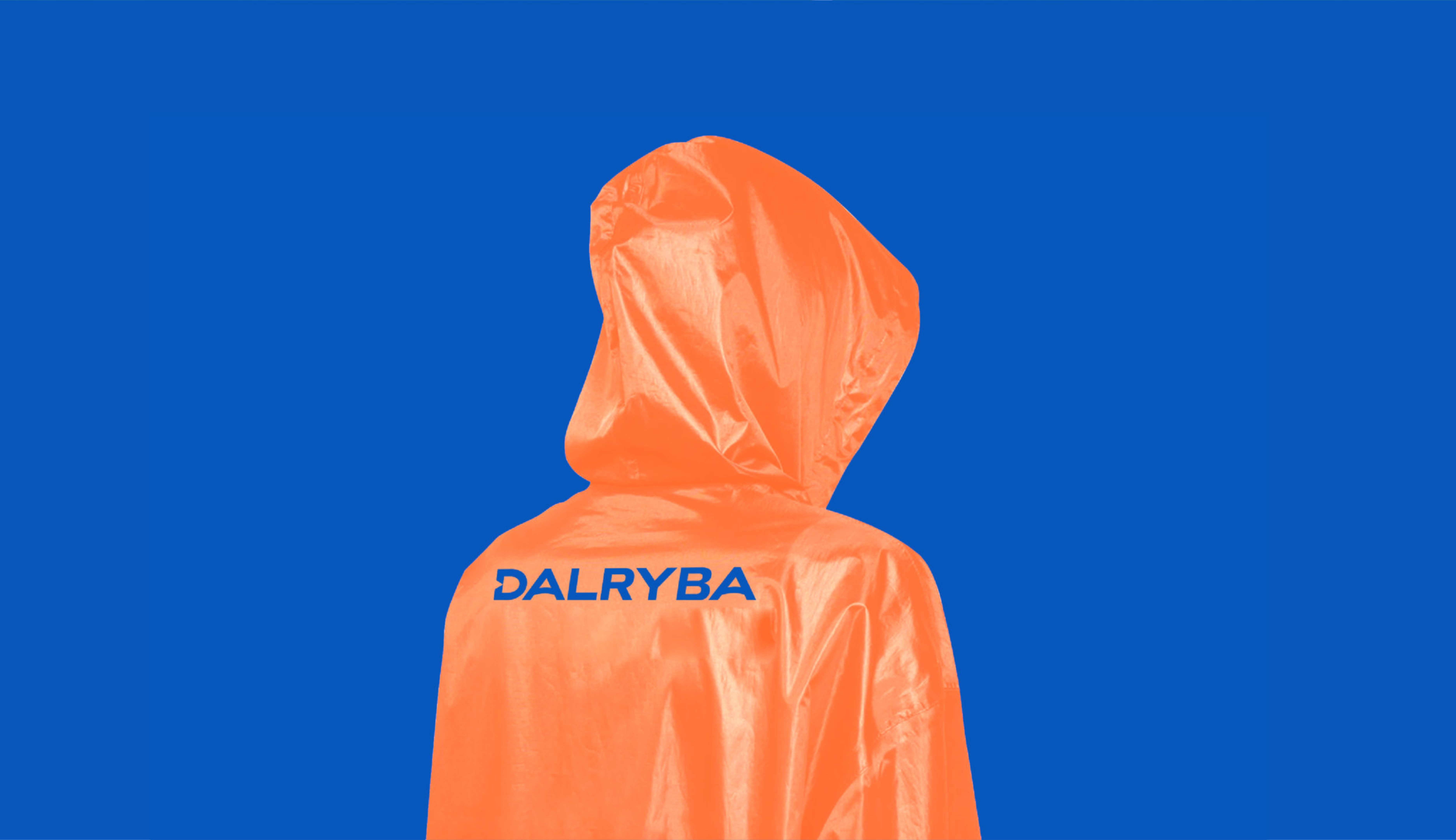
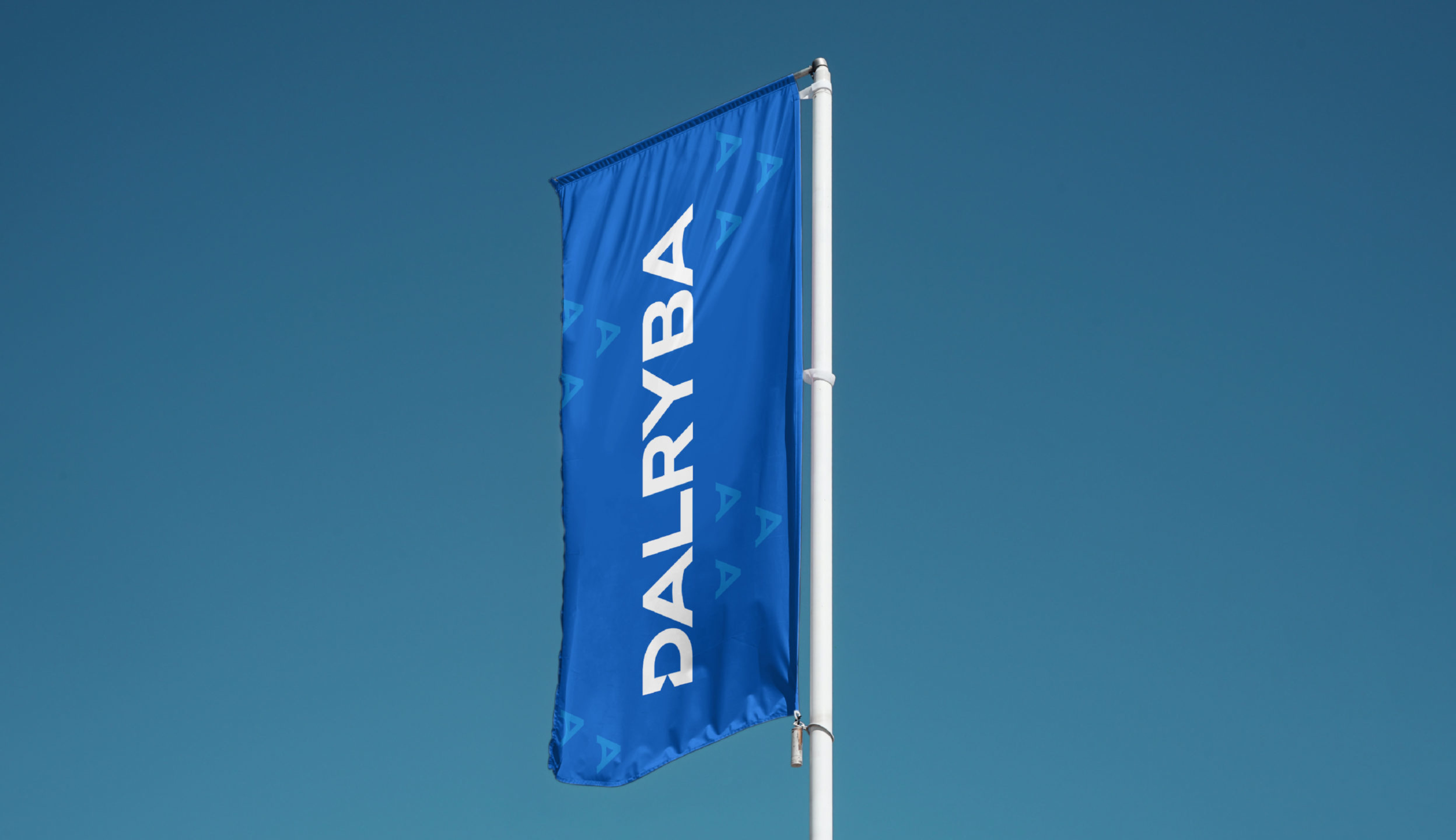
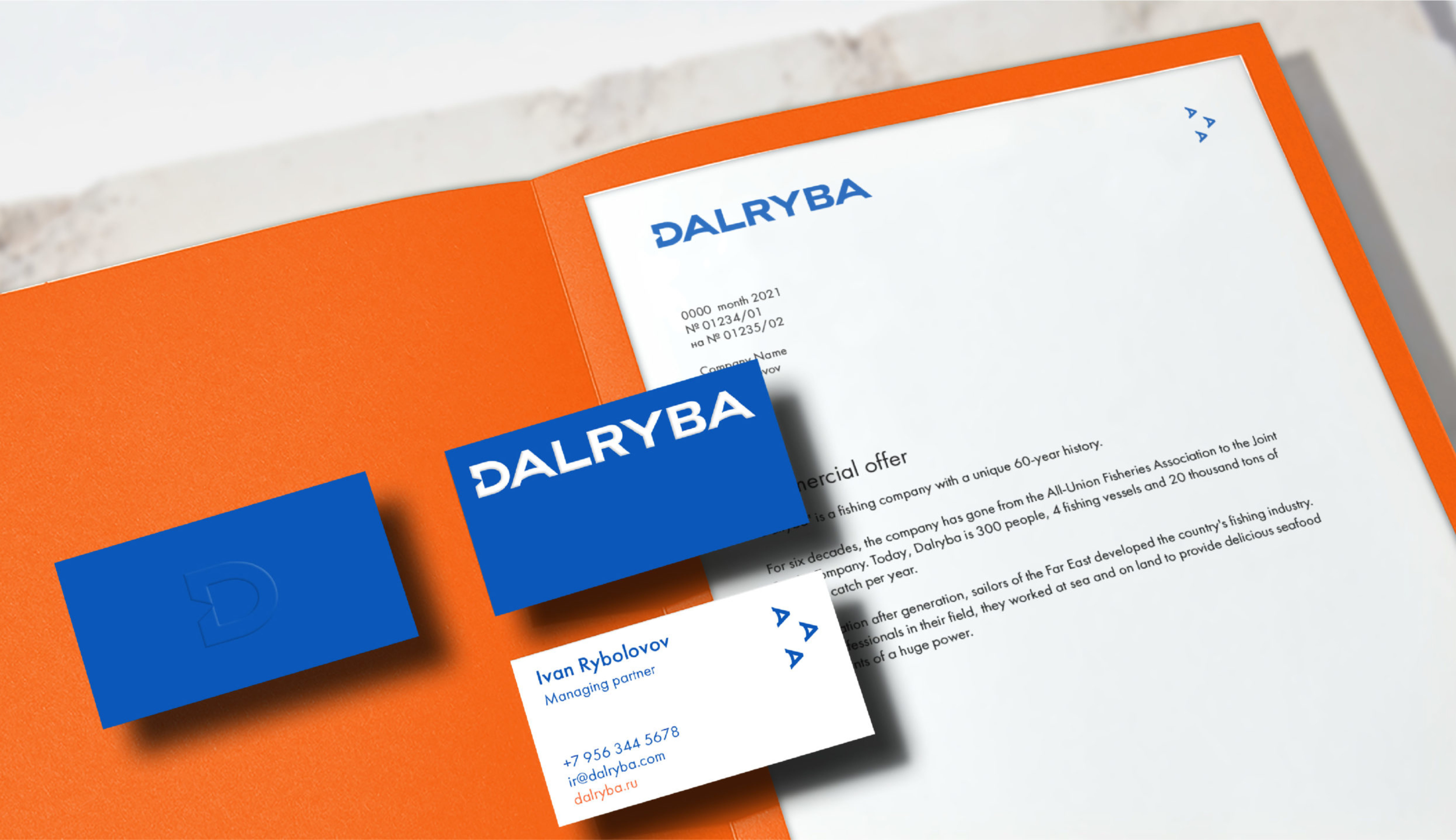
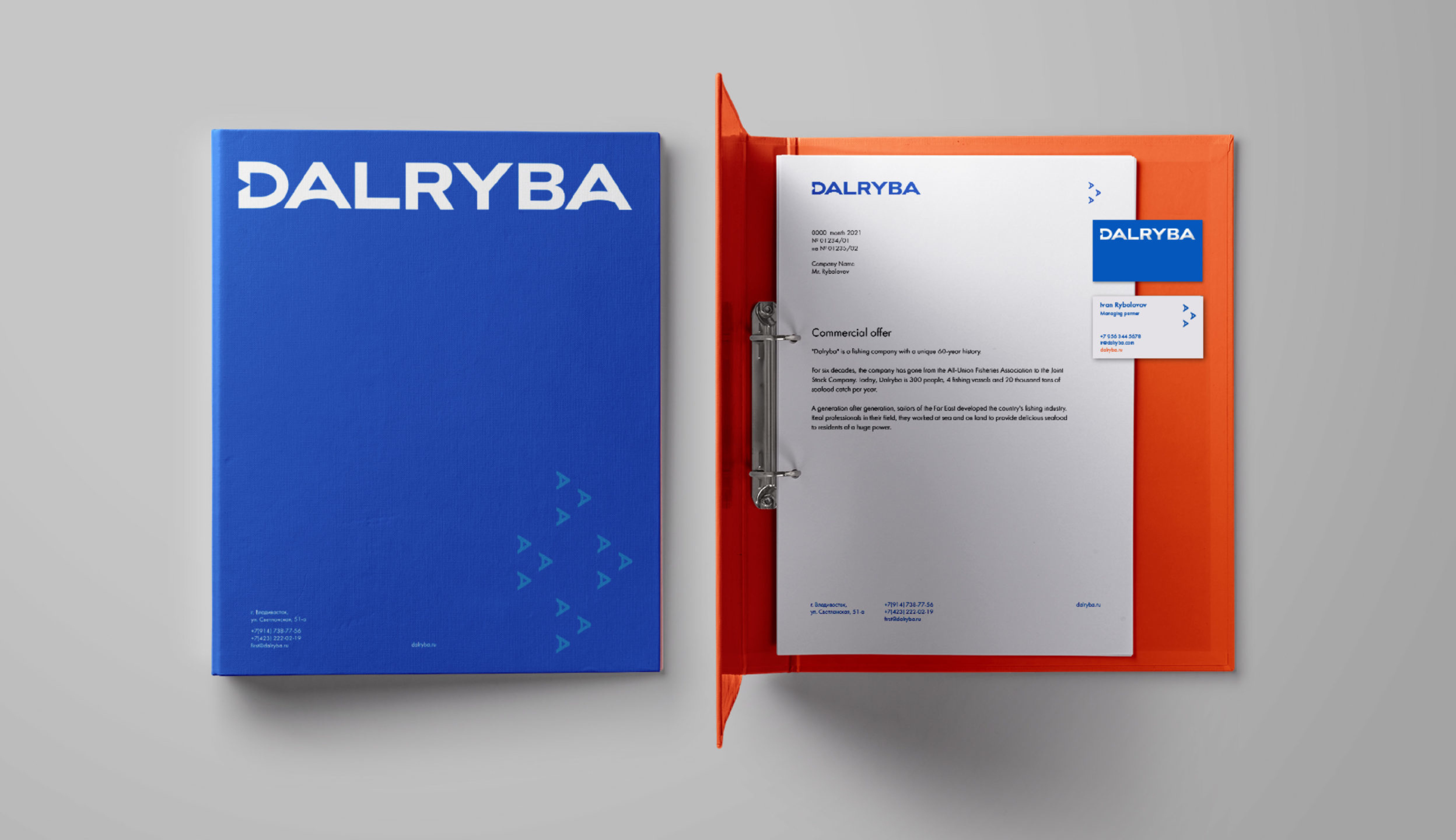
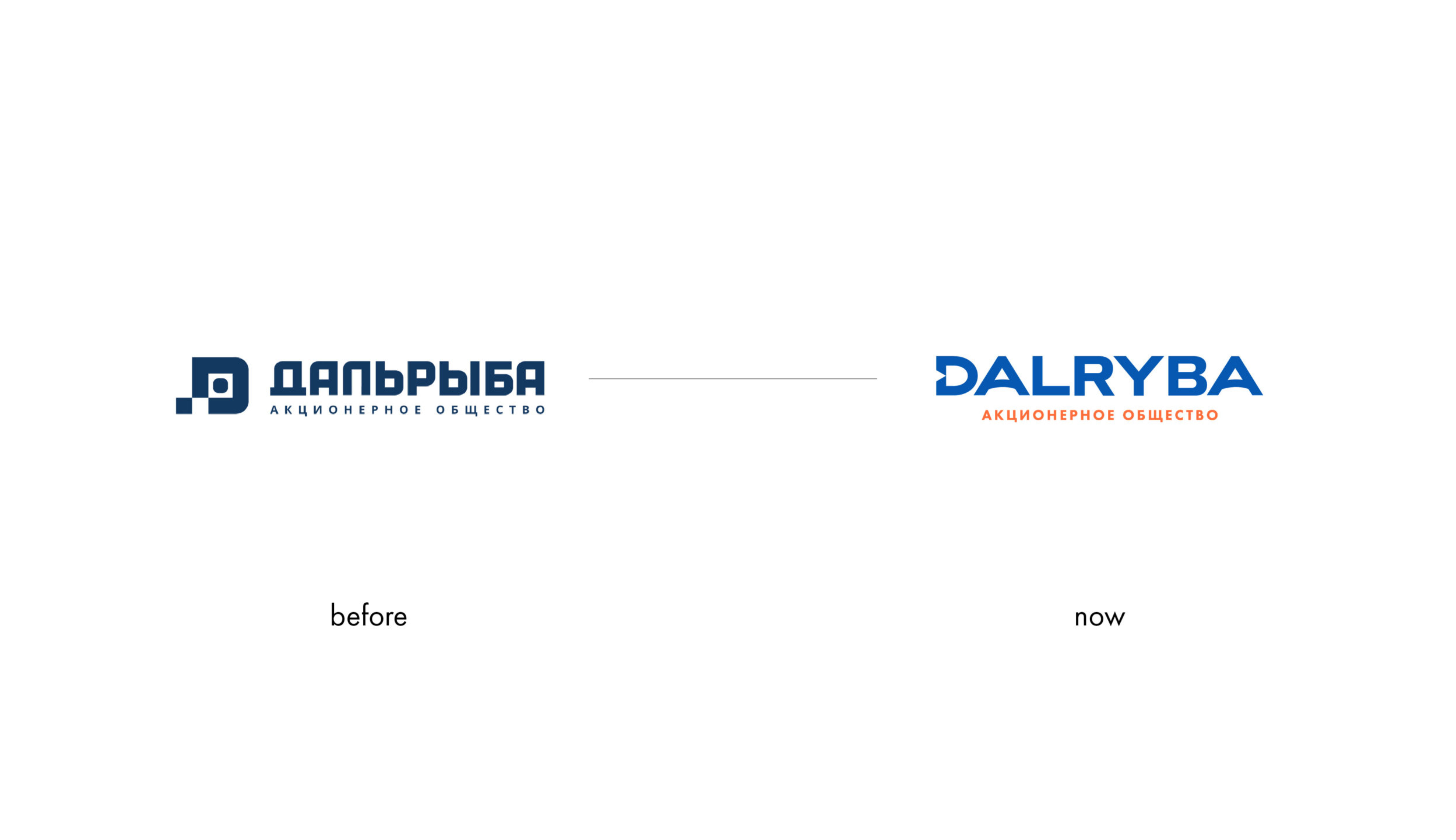
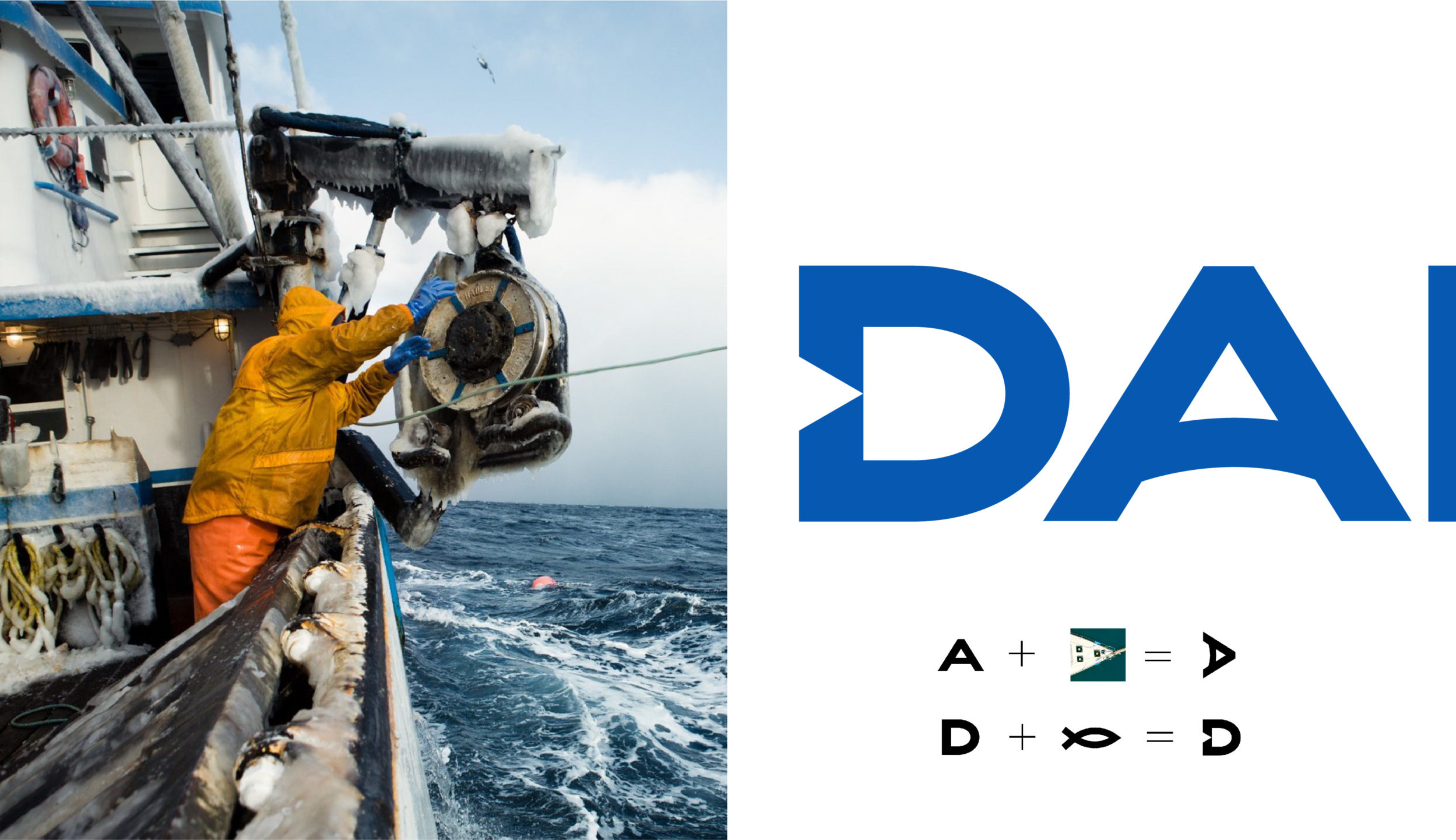
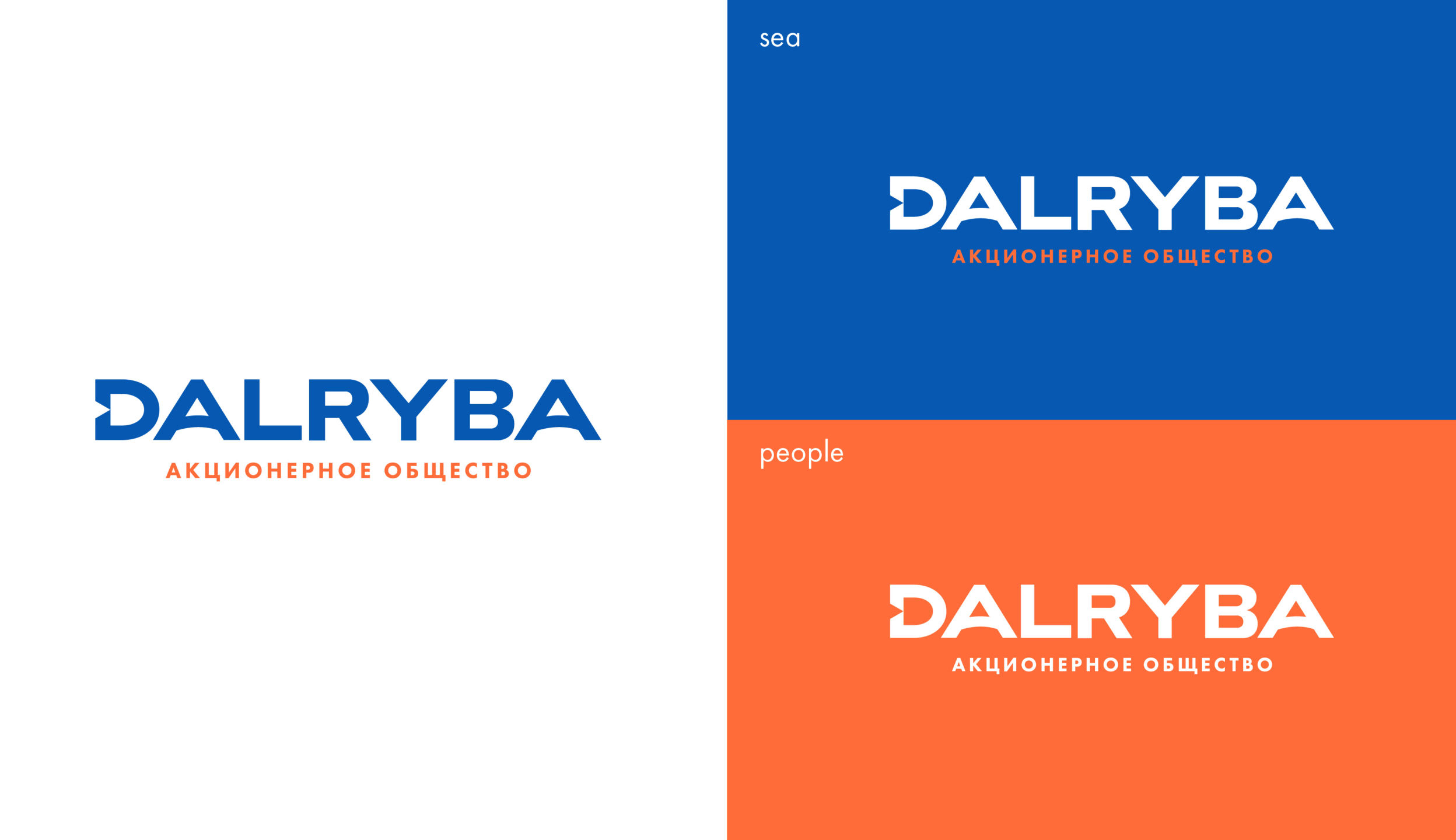
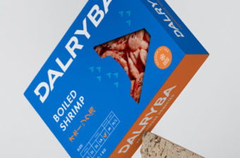
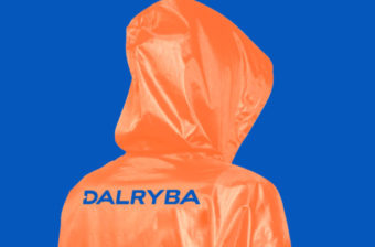
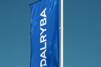
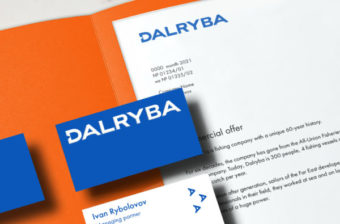
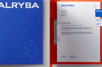
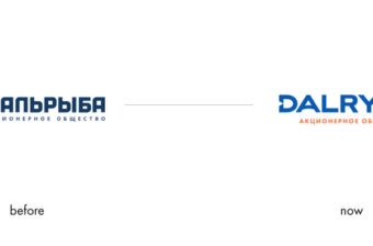
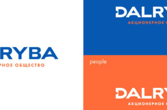
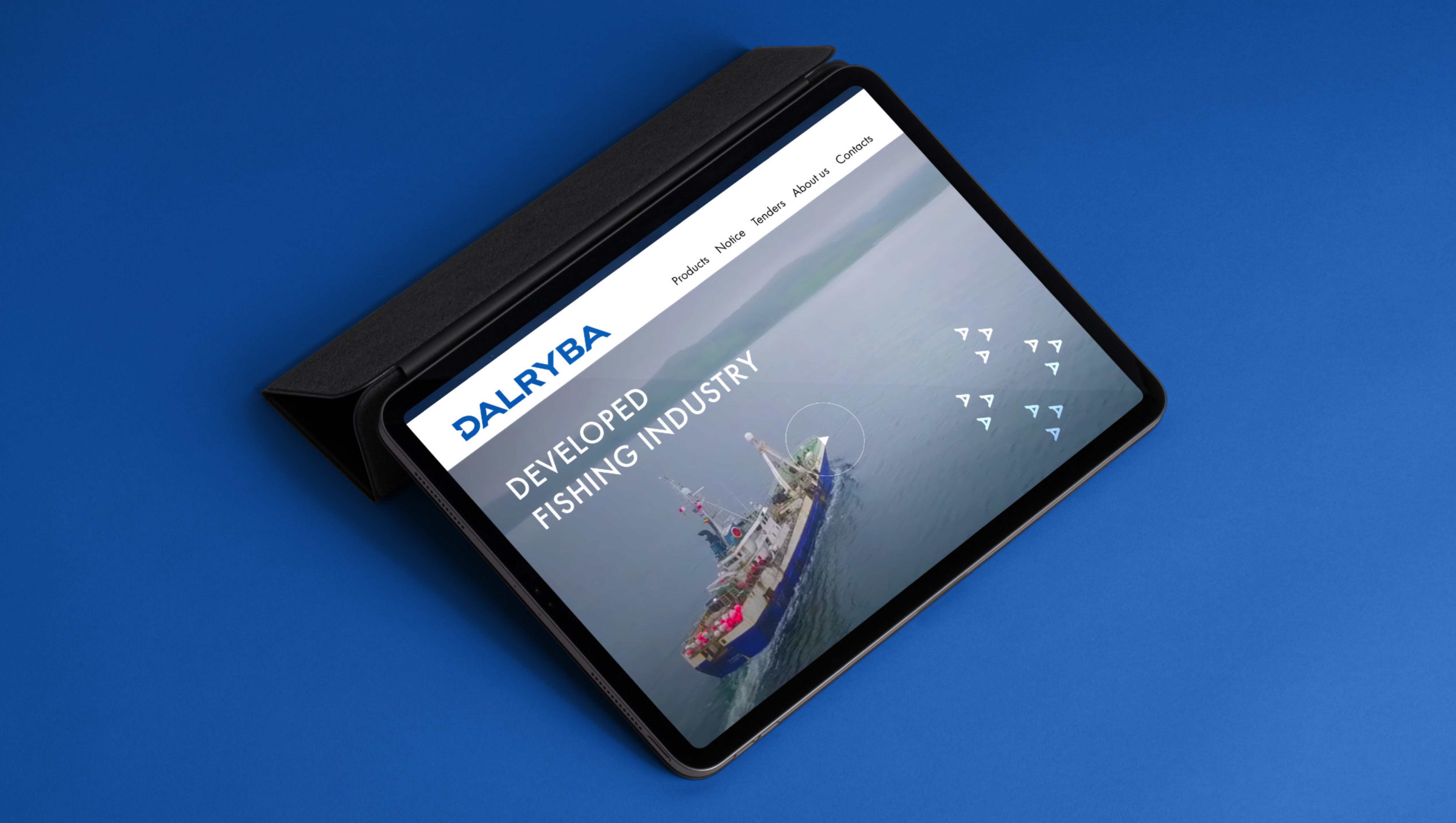
The new logo features a fish-shaped element within the letter ‘D,’ preserving the company’s heritage while introducing a sense of expansion and energy. We’ve integrated a graphic element inspired by the letter ‘A,’ creating a pattern reminiscent of fishing vessels navigating the open sea, ready for their catch. The brand colors mirror the serene depths of northern seas. This rebranding marks Dalryba as a modern, forward-thinking company with ambitious new goals.